
Government officials and the mass hysteria media have claimed, that in the past few months, we have suffered a huge epidemic of mass death resulting from the corona virus - and that this epidemic required the worst lockdown in human history to stem the tidal wave of fatalities. If either of these claims were true, then there should have been an INCREASE in fatalities resulting from the corona virus followed by a DECREASE in fatalities due to social distancing. The total fatality numbers are now in for January 2020 through April 2020. For Washington state, there was no increase or decrease in total weekly fatalities compared to previous years. This is a graph of weekly fatalities in Washington state for 2020, 2019 and 2018. This graph confirms that the corona virus did NOT increase fatalities in 2020. It also confirms that Social Distancing did NOT reduce fatalities in 2020.
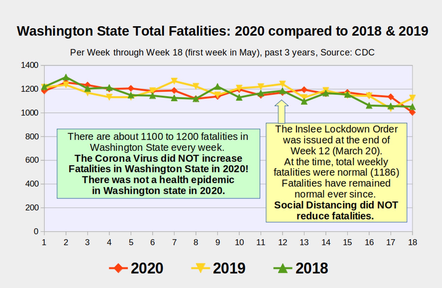
This graph may seem surprising to those who have been drinking the corona virus and social distancing snake oil served up daily by government officials and the mass hysteria media. But it is actually the expected result of the Null Hypothesis – which is one of the foundational principles of the scientific method. In this article, we will look at the difference between real science based on actual data versus fake science based on made up computer models.
In the past two articles, I used real scientific research and actual data to refute claims being made by fake scientists who have been using billionaire funded computer models to fool people about the corona virus. The reason billionaires have had such an easy time fooling people is that many people can not tell the difference between real science and fake science. The consequences of people not being able to tell the difference between real science and fake science is that more than 600,000 people will needlessly die in the US in the next year due to the worst crash of our economy in US history with 50 million people needlessly unemployed.
Therefore, in this article, we will use our two prior examples of real science and compare them to the Ferguson fake science computer model that was used by naive government officials to shut down our economy back in March 2020. I will show how real scientific research is done with the hope that this will make it harder for billionaires to fool people with fake computer models in the future. But first we need to take a deeper look at why people refuse to look at real science.
Social Distancing Snake Oil versus the Null Hypothesis
Many scientists who understand how viruses and our immune system work predicted months ago that the hospitals would be empty by the first of May once the immune system gets stronger - and that corona fatalities would begin to disappear by the first of June. We pointed out that social distancing actually harms the immune system and therefore would not work. We have been proven right.
But some people now claim that the reason the curve flattened and hospitals are now empty is because they took the Social Distancing Snake Oil of shutting down our economy and closing our schools. This claim that social distancing was the reason the corona virus was stopped completely ignores the fact that corona infections had fallen by more than 50% before the first shutdown order was issued. But how do we help people overcome their circular reasoning that the snake oil must have cured the illness – because they drank the snake oil and the illness was cured???
The solution is to look at the actual facts of how states and nations that drank the social distancing snake oil compared to states and nations that did not drink the snake oil. I have an entire chapter on this in my book and I have linked to numerous scientific studies about this in each of my previous articles. But still people insist on ignoring real science and continuing to believe that they were cured by the social distancing snake oil.

Imagine that a snake oil salesman comes to your town during a time when many people have been getting sick from the common cold. He claims that his snake oil will cure the common cold. People buy the snake oil and within a month, no one in town has the cold anymore. Gullible people might believe that drinking the snake oil cured the town. But if they were willing to look at the facts, they would see that half the people had been cured before the snake oil salesman ever came to town. And people in the next town were also cured of the cold even though fewer people in the town drank the snake oil. We are now to the point where more than a dozen studies have shown that there was no difference in outcome between states and nations that drank the snake oil and those that did not.
But it is difficult for some people to accept, given all the brain washing they were subjected to, that drinking the social distancing snake oil was NOT what actually stopped the corona virus.
If this were just an innocent cult of believing in snake oil and spending a few dollars on a snake oil addiction, it would not matter whether people continued to believe in the snake oil or not. But this is not just an innocent Social Distancing Snake Oil Cult. This is a cult that demands that everyone ignore science and drink the Snake Oil. The danger in everyone ignoring science and drinking the snake oil is that the snake oil is actually a poison that will kill 600,000 people in the US through economic mass suicide if we keep ignoring science and drinking snake oil.
This is why in science we have a fundamental principle called the Null Hypothesis. Snake oil – or any other intervention – is assumed to have no effect until it is proven with real data (not fake computer models) to make a real and measurable difference. There never was any evidence that social distancing worked. Instead, we now have a mountain of evidence that social distancing does not work.
Now that we understand that Social Distancing is just the latest version of snake oil, let’s take a closer look at how to tell real science from fake science.
Real Research Example #1 – Actual Hospital Admissions
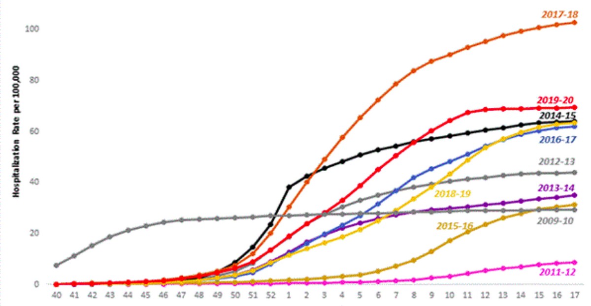
Our first article and video used actual hospital weekly admissions to determine the rise and decline of the corona virus over time. The reason we chose actual hospital admissions is because it can not be as easily manipulated as so-called “confirmed corona cases” – which is nothing more than a measure of how many tests are done on a given day. Here is a chart of hospital admissions for all flu seasons for the past several years:
Here is the link to the CDC Weekly Flu Report which includes the above chart: https://www.cdc.gov/flu/weekly/index.htm
This chart shows the cumulative number of hospital admissions each week per 100,000 population for each of the past 10 years.
You can see that the worst flu season we have ever had, in terms of hospital admissions was 2018 (the orange line). Since a consistent ratio of people who go to the hospital with the flu wind up dying (typically from bacterial pneumonia), it is reasonable to conclude that 2018 was also had the highest number of fatalities (it was over 70,000 people). You can also see that hospital admissions for every flu season for the past 10 years stopped at about the end of Week 17, which is the last week in April. The 2020 flu season which includes Flu Type B, Flu Type A and the Corona Virus (the red line) was the second worst flu season in terms of weekly hospital admissions. But it was only slightly higher than the 2019 Flu season (the yellow line).
Scroll up this same web page and you will see this rather complex graph:
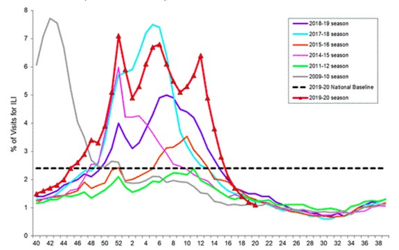
This is the Percent of Weekly hospital admissions compared to total hospital admissions for each of the past 10 years. The highest week ever for flu admissions was week 7 in 2018 (the light blue line) when flu admissions were about 8 percent of all hospital admissions. During the 2020 flu season (the red line), there were 3 peaks. Flu Type B admissions peaked at the end of December (week 52). Flu Type A admissions peaked at the middle of February and Corona Virus admissions peaked in the middle of March.
Because it takes an average of 10 days from the date of infection for flu admissions to become serious enough for people to go to the hospital, we know that flu infections peaked about March 4, 2020 – which was more than 2 weeks before the first shutdown or Stay Home order was ever issued. To get more precise hospital admission data for the current 2020 flu season, click on the link called View Chart Data which is at the bottom of the above graph. Here is a direct link to the Data Table. https://www.cdc.gov/flu/weekly/weeklyarchives2019-2020/data/senAllregt20.html
Here is what the top of this complex table looks like:
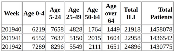
The data table starts in Week 40 of 2019 which was the beginning of the current flu season. What we are interested in are the 7th and 8th columns which are Total ILI (or flu admissions) compared to Total Patients. Because it has been claimed that the corona virus may have started killing people in late January 2020, and because it takes about a month from the time of hospital admission for fatalities to occur, we will scroll down and use the data starting at week 1 of 2020 – a week that ended on January 4 2020. The first row shows that 88,769 people were admitted that week with flu symptoms out of a total of one million 425,318 admissions. Here are the flu and total admissions for the first 8 weeks of 2020:
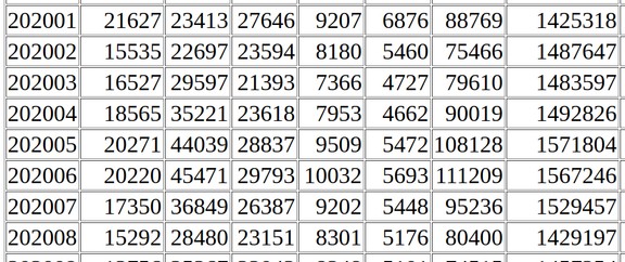
To simplify the data, and make it easier to create our own graph, I divided each number in the 7th and 8th column by 1000 and rounded to the nearest thousand. For example, for the first row, weekly flu admissions were 89 K or about 89 thousand and total admissions were 1425K or about 1,425 thousand which is also about 1.425 million. Note that the total capacity of all US hospitals is about 2 million admissions per week. So total admissions of 1.4 million is about 70% of US hospital capacity. Flu admissions were 6% of all admissions during this week but only 4.5% of total US hospital capacity. Here is a chart of the first 18 weeks of 2020 I made using this table of data:
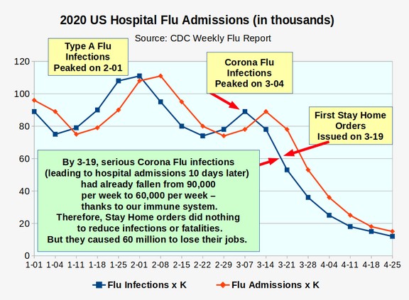
The red line is the flu hospital admissions. I made the blue line (which is the approximate date of infection) by moving the date back one week from the date of admission. The above graph makes it very clear that, thanks to the human immune system, corona flu infections had fallen 50% before the first Business Shutdown and School Shutdown orders were ever issued. Thus, there was never any need for any shutdown orders. Moreover, the slope of the line makes it very clear that social distancing had no effect at all in stopping the corona virus. It was stopped entirely by our immune system.
Here is a graph of flu admissions compared to total admissions for this same period:
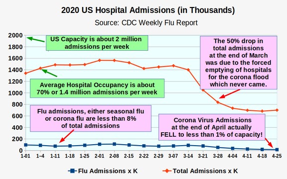
You can see that flu admissions admissions never overwhelmed US hospitals. In fact, flu admissions peaked at 7 percent of total hospital admissions on February 1, 2020. Now let’s compare hospital admissions – which make it clear that the corona virus problem ended by May 1, 2020 to Daily New Cases as are still being reported by the CDC:
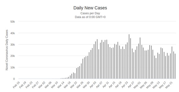
Here is a link to the above graph: https://www.worldometers.info/coronavirus/country/us/
The Daily New Cases graph makes it look like the corona virus problem is still creating havoc. There are still over 20,000 new cases being reported every day. But wait – if there are actually 20,000 new cases every day, then how come corona virus related hospital admissions have fallen to less than one percent of total hospital admissions in the US?
The answer is that daily new cases were never an accurate estimate of the actual problem. They are simply a reflection of the number of people being tested each day. Our immune system has already solved the problem. Daily New Cases are an example of Fake Data and Fake Science. Government officials and the mass hysteria media keep talking about daily new cases simply to fool you and keep you scared. Note that they never mention that our hospitals are now so empty that they are firing nurses and doctors.
Comparing Actual Hospital Admissions to the Fake Science Ferguson Computer Model
The first person to claim that corona virus hospital admissions would overwhelm the hospitals in the US was Neil Ferguson who published his Fake Science Computer Model on March 16, 2020. His model, which used no actual verifiable data, was then published in the NY Times and repeated by many government officials including Washington State Superintendent Chris Reykdal.
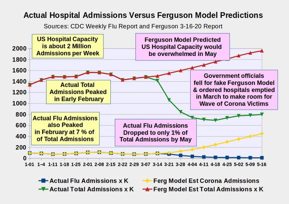
Because the Ferguson model was used to justify closing all the schools and businesses in Washington state on March 20, 2020, it is worth taking a closer look at it.
Ferguson claimed that Corona virus weekly hospital admissions in the US (the yellow line on the graph above) were going to skyrocket from about 100,000 per week to 500,000 by the middle of May – predicting that admissions would exceed total US hospital capacity on about May 20, 2020. Instead, actual corona virus admissions fell from 100,000 per week to only 10,000 per week by May 20.
Why did Ferguson over-estimate corona virus hospital admissions by a factor of 50?
One possible answer is that the only way for corona virus infections to exceed the admission capacity of US hospitals (2 million admissions per week) would be to over-estimate corona virus admissions by a factor of 50. It appears that the entire purpose of the Ferguson model was to construct a set of data which was deliberately intended to exceed the US hospital capacity. If this were the goal, it would also explain the need to extend corona virus fatalities into the month of June (another event which has never happened in US history) which in turn led to the now widely ridiculed estimate that 2.2 million people would die in the US from the corona virus by June 20, 2020. This is the problem with Fake Science Computer Models. They can be constructed to yield whatever result you want. They do not have to have any relationship to reality.
It is important to remember that the initial justification for closing all schools and nearly all businesses was to “flatten the curve” and prevent our hospitals from being overwhelmed. Government officials used the exact language used in the Ferguson Fake Science Computer model to lockdown and destroy our economy and create mass fear in America. Even today, people fail to realize that they and the government officials they relied on were all taken in by a fake science computer model paid for by Bill Gates.
I learned pretty quickly how to find out who is accepting bribes from Bill Gates. Go to his fake non-profit website and scroll to the bottom of the page. Then click on Grantees. This takes you to the Gates Foundation funding page. Here is a direct link to this Funding page. https://www.gatesfoundation.org/How-We-Work/Quick-Links/Grants-Database
Here you will find a handy Search box where you can enter the name of the grantee to see how much money Bill gave them to do his dirty work. Bill doesn’t pay people like Neil Ferguson directly. He pays their employer – which is called Imperial College. Enter Imperial College in the search box and the following screen appears:
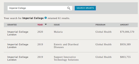
It turns out that Bill has given Imperial College 61 checks totaling more than $100 million dollars. Now we know why Neil Ferguson was willing to sell his soul to the devil by writing such a ridiculous and inaccurate report.
This still does not explain why Washington state officials, Chris Reykdal and Jay Inslee believed the obviously ridiculous report. But it does explain why the corrupt Mass Hysteria Media in the US promoted the Ferguson report. It is because Bill Gates basically owns the Mass Hysteria Media. Whenever you listen to any of the major news channels, you are basically listening to talking heads who are on the Bill Gates payroll – in addition to being on the Drug Corporate payroll. Now that we know how real versus fake science works with assessing the number of corona patients, we will next look at how to use real science to assess corona fatalities.
Real Research Example #2 – Actual Weekly Fatalities
While daily new cases have remained about the same, daily deaths have been falling ever since I published my book on May 8, 2020:
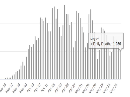
Daily US deaths were over 2000 on May 8. But as of May 23rd, they have fallen to just over 1000. However, even this number of 1000 corona virus fatalities a day has been highly manipulated, as we have reviewed in our previous articles and videos, by the fact that the CDC changed the rules on March 4, 2020 to require hospitals to list the corona virus as the cause of death even in cases where there was no test. Hospitals are even given thousands of extra dollars for each corona death they report. These two incentives led to a huge increase in reported corona fatalities after March 4, 2020 to the point where the US as of May 24, 2020 is reported to have 100,000 corona fatalities. This is more than double any other country on the planet.
Because the CDC has fudged the number of “reported corona fatalities” we need to find a more accurate way of determining actual corona virus fatalities. In my book, I used month to month average flu season fatalities to estimate that corona fatalities were in fact over half the time simply seasonal flu fatalities that had been reported as corona fatalities. I then predicted on May 8, 2020 that by the end of May, there would be about 120,000 reported corona fatalities and 60,000 actual corona fatalities. This estimate still appears to be about right on a national level where there are so many unpredictable factors.
However, we can get a much more accurate estimate if we focus on a particular state. I therefore focused on the State of Washington in comparing the 2020 flu season to the 2019 flu season. To see the week by week data for your state, go to this CDC web page:
https://www.cdc.gov/nchs/nvss/vsrr/covid19/excess_deaths.htm
Then scroll down to Options, Data.CDC.gov and click on the link called National and State Estimates. Here is a direct link to this page:
https://data.cdc.gov/NCHS/Excess-Deaths-Associated-with-COVID-19/xkkf-xrst/
Then click on View Data.
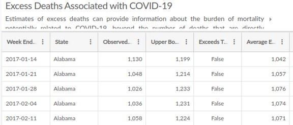
This CDC table has 37,854 rows and starts with Alabama in 2017. Click on the three dots to the right of the word State to change the order to Sort descending. This puts Wyoming at the top of the table. Click on Next about 20 times to reach Washington. Here is a Table of the months of January and February 2020 compared to 2019:
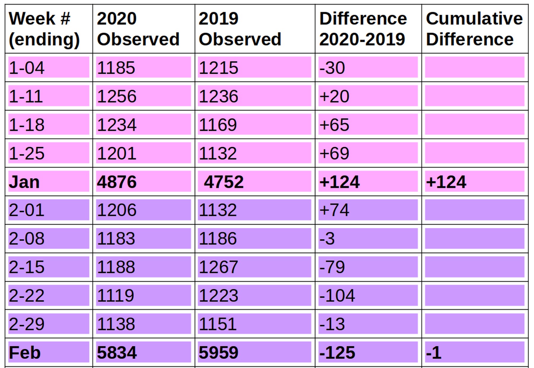
The first row on this table is all fatalities that occurred in Washington state during the first week of January which ended on Friday, January 4th. It shows that 1,185 people died on the first week of 2020. This was 30 less than 1,215 people who died during the first week of 2019.
The next three weeks, many more people died in 2020 than died in 2019. If all we looked at was these three weeks, we might incorrectly assume these were corona virus fatalities. But then look closely at the month of February. Suddenly these fatalities drop off in 2020 compared to 2019. by the end of February, there is literally no difference in fatalities between 2020 and 2019. January 2020 had 124 more fatalities than 2019. But February 2020 had 125 fewer fatalities than 2019.
Now let’s look closely at what happened in February and March of 2020 compared to the same two months in 2019.
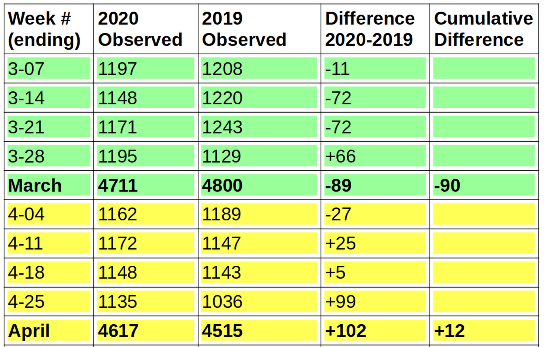
There were 89 fewer fatalities in March 2020 than in March 2019.
Then there were 102 more fatalities in April 2020 than there were in April 2019. What we are seeing here is the normal variation in flu fatalities from one year to the next and one month to the next.
By the end of April, there was no significant change in fatalities in Washington state from 2019 to 2020. In total, only 12 more people died in 2020 by the end of April than died in 2019 by the end of April.
Why this is important is that the legal definition of an epidemic is a period of time in which a disease causes a “significant increase in infections or fatalities above the historical average.” At no point in 2020 were fatalities in Washington state “significantly above 2019 fatalities” or “significantly above the average of the past several years. Therefore, there was no corona virus epidemic in Washington state in 2020. Therefore, there never was a health emergency in Washington state and Inslee’s shutdown orders were based on claims that were factually incorrect.
So now let’s look at what has happened so far in the first three weeks of May 2020.
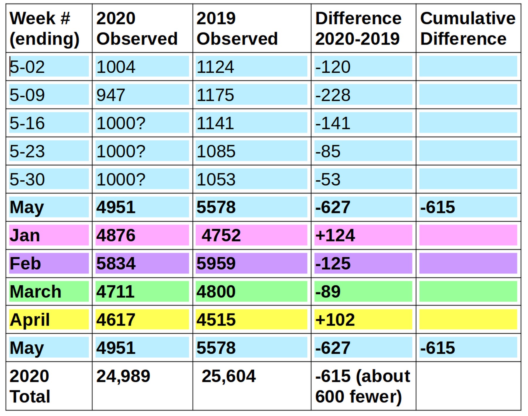
I have had to make some projections for the final weeks of 2020 since the actual numbers have not been reported to the CDC yet. But it is clear that fatalities are much less in May 2020 than they were in May 2019.
Comparing the Actual Number of Fatalities in 2020 to the Ferguson Estimate of Fatalties
On March 16, 2020, Ferguson published his fake model predicting that US hospitals would be overwhelmed with Corona victims by May 20, 2020 and that fatalities in the US would reach 2.2 million by June 20, 2020. Here is a link to the Ferguson report: https://www.imperial.ac.uk/media/imperial-college/medicine/sph/ide/gida-fellowships/Imperial-College-COVID19-NPI-modelling-16-03-2020.pdf
As noted earlier, there is a huge and glaring problem with this graph. Ferguson claims the Corona virus will take 3 months to reach a peak. This is completely contrary to all past flu epidemics in the US – where it took just over a month to reach a peak and another month to end. It is also completely contrary to what happened with corona virus attaks in China and South Korea where it took just over one month to reach the peak and another month to end. This error alone explains how Ferguson was able to come up with such an extremely high number of fatalities. He just kept letting the curve double and double for month after month beyond all reason. Here is the Ferguson graph showing how these 2.2 million deaths in the US will occur.
Note that his fake epidemic computer model starts on March 20, 2020 which is days after he published his model. His model does not reach a peak until June 20, 2020 which is three months later – in complete contradiction to the facts of previous viral epidemics.
Also note that the scale on the left is Deaths per day per 100,000 population. The blue line, which is the US curve, reaches a peak of 17 on June 20, 2020. To calculate the total US deaths per day, we use the US population of 330 million = 3300 times 100,000. So 17 deaths per 100,000 per day converts to 17 x 3300 = 56,100 fatalities in the US on the single day of June 20, 2020.
Here is a table of his estimated fatalities for various dates:
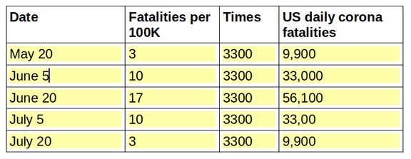
Note that the Ferguson model predicts that most of the 2.2 million fatalities will occur between May 20 and July 20. For May 20, Ferguson predicted that there would be about 10,000 fatalities per day. In fact, as of May 24, 2020, claimed US fatalities were only about 1000 per day – with real corona fatalities being much less than that.
Since Washington state is about 1/50 of the US population, the Ferguson model predicted that 44,000 people would die in Washington state from the corona virus by June 20, 2020. Clearly, with only 1,000 claimed fatalities so far and the numbers dropping every day, Washington state will not have 44,000 fatalities by June 20, 2020.
Conclusion
Hopefully, you now have a better idea of how to tell real science using actual data from fake science using made up computer models. Anyone who still is believing in fake science computer models instead of relying on real data is suffering from a severe case of brain washing and needs to stop listening to the mass hyteria media. What they are selling you with their fake computer models is not real science. It is fake science. It is nothing more than snake oil packaged up in computer models to look like real science.
If we do not open the economy ASAP, we will be facing the worst economic disaster in US history with 50 million unemployed and an additional 600,000 lives lost due to drug abuse, alcoholism, homelessness and lost health insurance.
Please wake up and do some real research. At the very least, take a few minutes to read the first chapter of my book. You can read it for free at the website: commonsensebook.org
Hundreds of thousands of lives as well as our economic future are hanging in the balance. As always, I look forward to your questions and comments.
Regards,
David Spring M. Ed.
spring for schools at gmail dot com