
The best predictor of future epidemics is past epidemics.
David Spring M. Ed.
As explained earlier, the Ferguson model made a crucial and obvious math error in assuming a time to peak fatalities of 90 days. I noted that the time to peak fatalities in China and South Korea was only 30 days. Based on this time to peak, I estimated that the US should reach peak fatalities on about April 20th (not June 20th as claimed by Ferguson.
However, the reason I chose April 20th as the peak date was to simplify the math. I knew that the peak was about one month when viewed on the large scale of a nation. It was also clear from his graph that Ferguson had chosen 3 months as the time to peak. Thus, it was Ferguson who set the start date for this ticking time bomb as March 20, 2020. I agree that Ferguson was correct about his start date - but he was clearly wrong about his peak date being on June 20.
The truth is that all epidemics are local. They occur in local cities, local counties, local states. National epidemics are simply sums of local epidemics. For example, in the US, the epidemic started about one week earlier in Washington State and New York state than in the rest of the US. Therefore, these two states should reach a peak about one week before the rest of the US. If the US peak will be reached about April 20th, the peak in Washington state and New York state should have occurred about April 13, 2020.
In this section, we will go into more detail about the math of epidemics and what early factors might be used to predict total fatalities.
The first key is to estimate the date when any particular virus reaches a critical mass. This is a threshold at which the virus has achieved a high enough concentration in a given local population to become self-sustaining.
This critical mass threshold can be difficult to determine with a well cloaked virus like the corona virus as most victims exhibit few if any symptoms. Therefore, it is not accurate to try to use numbers of infections because this number cannot be accurately known at the beginning of any epidemic. This is why throughout this book, I ignore the whole debate over the number of infections.
Instead, what can be more accurately known is the number of fatalities. Regardless of the percent of people infected or the total number of people infected, the total number of people reported as being killed by the virus will be a more stable number.
I want to be clear that I do not think that the reported number of people being killed is an accurate number. I am certain that many people who were claimed to have been killed by the corona virus were actually killed by other factors related to problems with their immune system – such as cardiovascular disease.
However, the reported number of people killed by the virus on any given day does not have to be an accurate number. It merely needs to be a stable number over time. I am assuming that the rate of fatality over-reporting remains the same during the entire period of the epidemic.
Examples of Estimating the Date of Critical Mass
A smaller number of fatalities is needed to determine a critical mass in a smaller region, such as a state, than in a larger region, such as the United States. This critical number is an arbitrary number. But it should be a simple number to keep the math simple during the doubling. On a state level, I have used a number of 100 fatalities. My assumption is that local states will begin to take significant voluntary or mandatory isolation actions when the number of local fatalities reaches 100.
But I am also assuming that by the time these actions are taken, the virus will have already spread widely in the community. In other words, that the extreme social isolation actions will be completely ineffective. The eventual reduction of the virus will have nothing to do with the social isolation measures adopted – and everything to do with the natural immune systems of people within the community. We will cover the research on the lack of effectiveness of social isolation measures below in this and other chapters.
The reason I am using State data instead of city or county fatalities is that State data is more available. In Washington state, fatalities exceeded 100 on about March 24, 2020. In New York State, fatalities exceeded 100 on March 22, 2020. Because there is a 10 day delay from infection to fatality, this means that the corona virus reached a critical mass in New York and Washington state on about March 13, 2020. https://www.worldometers.info/coronavirus/country/us/
On a national level, we will use 2000 as the critical mass. US fatalities exceeded 2000 on March 30, 2020. This means that the US as a whole is about one week behind New York and Washington.
New York is an interesting example of what happens when mass hysteria overtakes objective scientific reasoning. The governor of New York, Andrew Cuomo, claimed on March 17, 2020 that peak fatalities would not be reached for 45 days – meaning about May 5th. This estimate was likely based on the reckless and unsupported Ferguson report – meaning that no member of Cuomo’s staff was able to figure out that the Ferguson report was a deeply flawed report. Because there were no rational people on Cuomo’s staff, the entire state of New York has been subjected to a needless and economically devastating shut down. We can only hope that the people of New York remember this insane nonsense at the next election.
Seven days later, on March 24, 2020, Cuomo was forced to dramatically scale back his prior prediction by nearly an entire month. His new claim was that the peak would be reached in 14 to 21 days – meaning about April 7 to 14. He claimed this was based on “new modeling.” In fact, it was simply based on more accurate modeling. The actual data has not changed in the past week.
University of Washington Analysis Matches My Own Analysis
A new model estimating corona virus fatalities was produced by researchers at the University of Washington School of Medicine and released to the public on March 25, 2020. As with the model I have created, these researchers used reported deaths to create their model. However, unlike my model, these researchers assumed that social distancing will have some sort of effect in reducing the rate of fatalities. As I will shown later in this book, this assumption on the effectiveness of social isolation is not correct. But the date of enactment of social isolation policies is nearly identical to the “critical mass” dates I have used – which is my their estimates reached about the same conclusion as my estimates – that a peak will occur in New York and Washington by about the middle of April – not in May or June.
Sadly, the mis-informed researchers at the UW claimed at the beginning of their paper that their prediction was based on “assuming that social distancing measures are maintained.” They then stated that they predict that there will be 81,000 corona virus fatalities in the US in the next four months.
In short, they are advocating for extending the insane social isolation policies for several more months. They also note that there is a high degree of uncertainty in their estimate of 81,000 fatalities. They report a range of as few as 38,000 to as many as 160,000 fatalities. All of these estimates are way less than the 2.2 million predicted by Ferguson just a week or two earlier.
As a saving grace, the researchers also adjusted for the rate and timing of exponential growth of the corona virus in other nations just as I did. Thus, since we have about the same starting date and about the same growth rate, we reached about the same conclusions.
Here is a link to the UW analysis: http://www.healthdata.org/sites/default/files/files/research_articles/2020/covid_paper_MEDRXIV-2020-043752v1-Murray.pdf
The analysis projects New York State will need 48,311 hospital beds on the peak date of April 6. The state will need 7,667 ICU beds and 4,141 invasive ventilators at the peak. As the peak in hospital beds will occur about one week before the peak in fatalities, this means that the UW study estimates that peak fatalities in New York state will occur on about April 13, 2020. Although it is a bit of a coincidence, this is the exact date that I came up with in my calculations done more than a week before the release of the UW report. This does not mean that April 13, 2020 will be the actual peak. The peak could occur a week sooner or a week later than this. But I am confident that a peak did occur well before the end of April.
They also predict that the US peak will occur about one week after the peak in Washington state and New York state. They further state that deaths in the US will drop below 10 deaths per day between May 31 and June 6. My previous calculations also concluded that the epidemic would be mostly over by the end of May. So I am happy that the UW researchers agree.
Sadly, on page 2 of their report, they note that their report was funded by the Gates Foundation – which has been the group pushing the need for extreme social isolation policies. It is no wonder then that this group ignored the research refuting the policies advocated by Bill Gates. I want to make it clear that I have not been bought by the Gates Foundation and I think their manipulation of scientific research has been extremely damaging to the entire world economy.
The world would be far better off using my model which is based on viral critical mass being checked by the human immune system rather than the Gates model of using enactment of social isolation policies to check the spread of the virus.
Page 2 of the UW 25 page report provides some background information on the corona virus. Here is a quote that is relevant to both the method I am advocating and the method they have used to estimate a date to peak fatalities:
“COVID-19 forecasts have largely been based on mathematical models that capture the probability of moving between states from susceptible to infected, and then to a recovered state or death (SIR models). Many SIR models have been published or posted online. 3–20. In general, these models assume random mixing between all individuals in a given population. While results of these models are sensitive to starting assumptions and thus differ between models considerably, they generally suggest that given current estimates of the basic reproductive rate (the number of cases caused by each case in a susceptible population), 25% to 70% of the population will eventually become infected.
The UW report then lists 17 models or studies of corona virus fatalities they looked at (references 3 through 20). We will note and comment on a few of the more important ones here including references 6 and 20 to see where they came up with 80% of the population being infected.
At the bottom of page 2, they reach the same conclusion I reached that the most accurate number to model is daily fatalities: “An alternative strategy is to focus on modeling the empirically observed COVID-19 population death rate curves, which directly reflect both the transmission of the virus and the case-fatality rates in each community. Deaths are likely more accurately reported than cases in settings with limited testing capacity.”
On page 3, they set a minimum critical mass death rate threshold of 0.31 per million. For Washington state, this was less than 3 deaths per 8 million population. I think this is way too low.
They then assumed that US states without social isolation laws will put them in place within the next week. This is not likely to happen as we will explain in our chapter on the drawbacks of social isolation.
At the bottom of page 8 and top of page 9, they list some limiting factors. Surprisingly, they do not list the poor air quality in Wuhan China and Northern Italy, Instead, they blame the high fatality rates on restricting ventilation in the elderly. Certainly, the lack of ventilators in Italy and Wuhan may have increased fatalities.
But they were not the underlying cause of the fatalities as many of the fatalities in hospital were on ventilators and many of the fatalities died at home and never made it to the hospital. So it would not have mattered whether there were more ventilators or not. In any case, the US leads the world in ventilators so this problem will not be as big a factor here as it was in China and Northern Italy.
They conclude their study on page 8 by stating: “Our estimate of 81 thousand deaths in the US over the next 4 months is an alarming number, but this number could be substantially higher if excess demand for health system resources is not addressed and if social distancing policies are not vigorously implemented and enforced across all states.”
The provide no evidence to support this claim. I am sure that Governors across the US will use this report as a further excuse to maintain draconian social isolation policies – and then give themselves a pat on the back once the peak of the fatality curve has passed – despite the fact that the shape of the curve has almost nothing to do with draconian social isolation policies and everything to do with the natural human immune system.
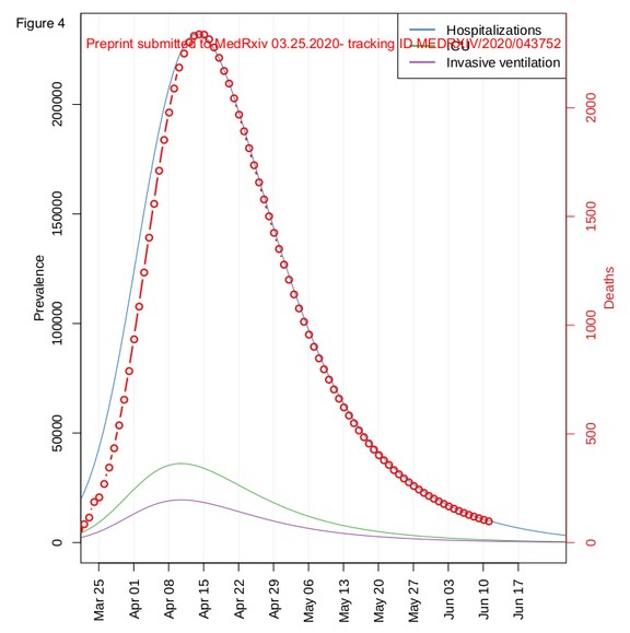
Page 17 has Figure 4 which is their estimated US daily death rate in red with a peak of 2200 on April 15 2020 :
On page 20 of the UW report is a surprising graph showing that only a few states would exceed the bed capacity of their hospitals:
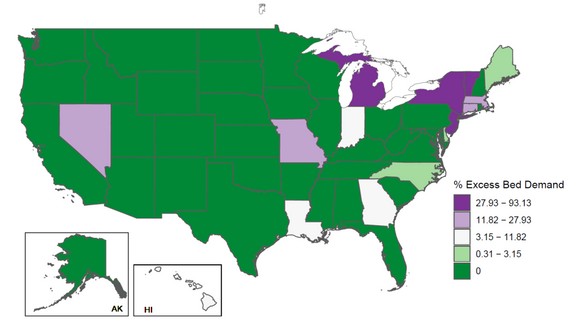
I have not studied the hospitals in New York. But I did study the hospitals in Washington state and concluded about one week ago that Washington state would not exceed either its beds, Intensive Care Units or ventilators. So I am glad that this study reached a similar conclusion. (Figure 8, not shown, also concluded that Washington state would not have a shortage of Intensive Care Units).
Next let’s look at some of the other models they used to inform their own model:
11. Anastassopoulou, C, at al. Data-based analysis, modeling and forecasting of the COVID-19 outbreak. MedRxiv. March 2020. https://www.medrxiv.org/content/10.1101/2020.02.11.20022186v5.full.pdf
“As the number of infected individuals, especially of those with asymptomatic or mild courses, is suspected to be much higher than the official numbers, we have repeated the calculations under a second scenario that considers twenty times the number of confirmed infected cases, leaving the number of deaths unchanged. “ This was the first study I read that used a ratio of 20 to 1. They did report a doubling time of 6 to 7 days.
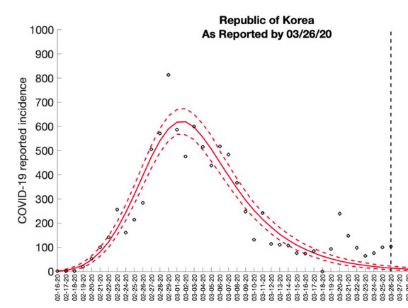
14. Georgia State University. Corona virus Incidence Forecasts.
This has several useful graphs showing the timing to peak in several countries. Here is South Korea with minor voluntary showing a start on February 16 and a peak 3 weeks later:
15. Carnegie Mellon University. Mathematical model shows heterogeneous approach might be best for reducing COVID-19 deaths. Mellon College of Science. Published March 17, 2020
Here is a quote: “Strategies which focus on minimizing transmission rates to every extent possible in the entire population could increase deaths among all age groups. We found that a heterogeneous approach that focuses efforts on decreasing transmission of the virus among the most at-risk populations, specifically those over 65, would result in the fewest number of deaths.”
What’s Next?
We will next look at evidence that hospitals were not overwhelmed by the corona virus.